What is Easy Read
What is Easy Read?
Our top ten tips for creating effective Easy Read information
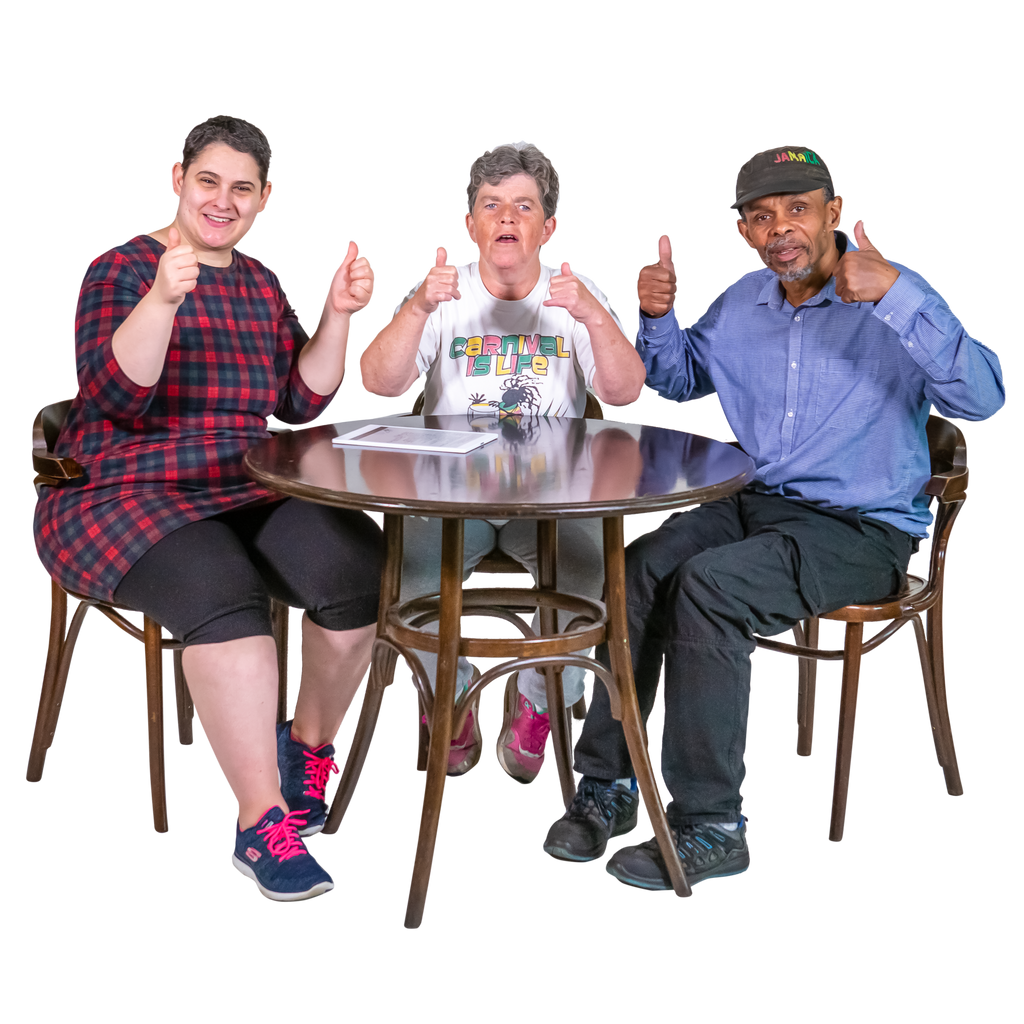 |
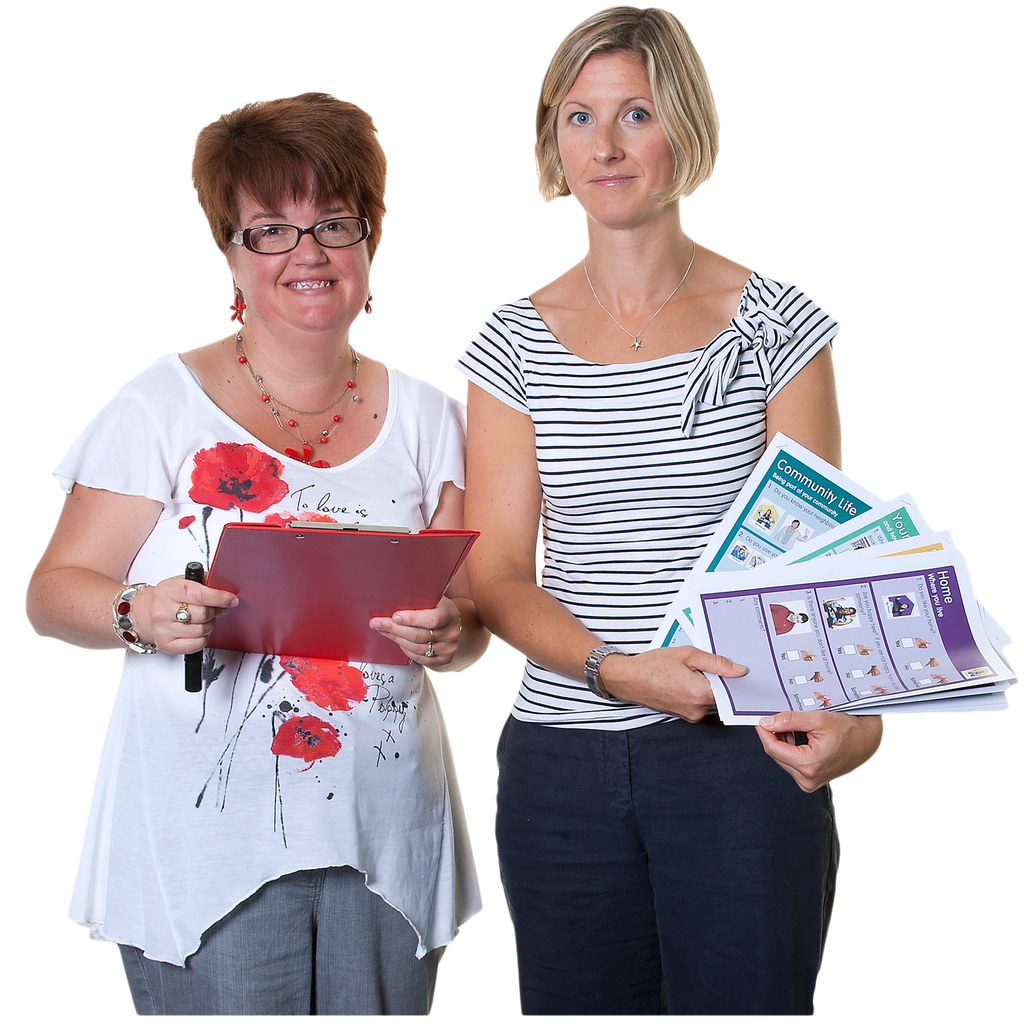
Easy Read is an accessible information format designed for people with a learning disability. The words are made easier to read, the text is big, and pictures are used next to the words. |
 |
1. Think FirstBegin by asking yourself a few questions. Who is the information for? What are the important things you want to tell people? Are you expecting a response? This will help you keep focus on what's important. |
 |
2. Keep it shortWhen it's time to start writing, keep it short — under 1000 words is a good target with sentences under 15 words each. Imagine you're talking to someone as you write, and avoid difficult or jargon words. EasyMaker can help you get started — use AI to convert complex documents into clear, simple language, or write from scratch using the block editor. |
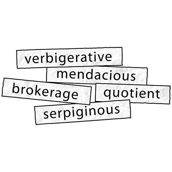 |
3. Explain hard wordsUse bold text to highlight important points or difficult words. Explain what they mean the first time you mention them. You can also use box-outs to explain something really important — they're easier to spot if your reader needs to refer back to them. |
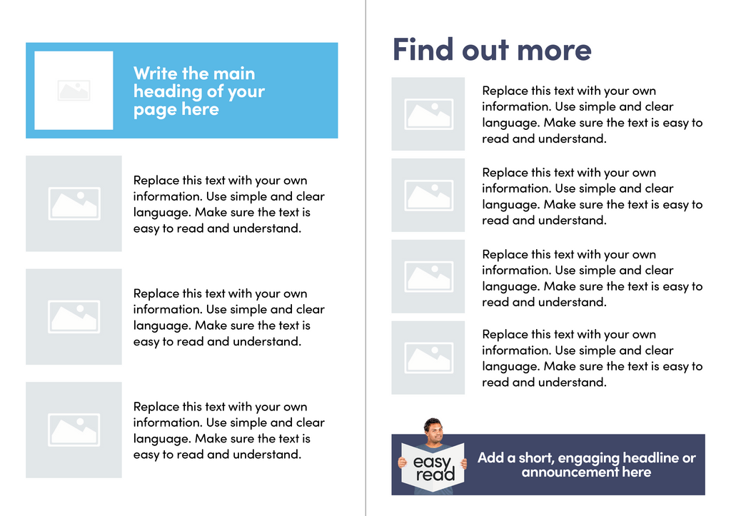 |
4. LayoutPlace pictures on the left and words on the right. Use a different picture or two for each paragraph of text. EasyMaker handles layout automatically, ensuring your documents are clear and consistent every time. |
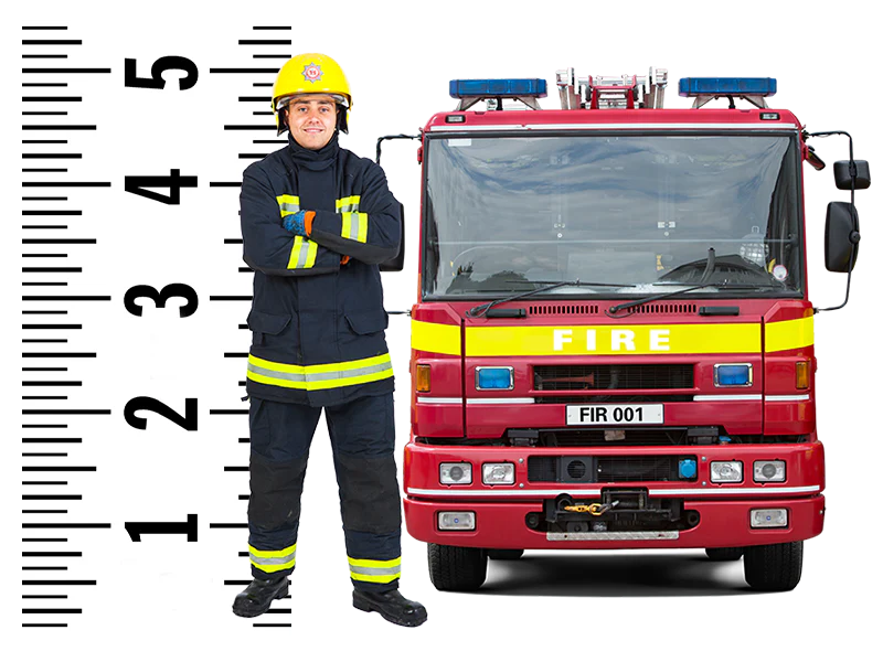 |
5. Picture sizeMake sure your pictures are big enough to see clearly — about 4–5cm in size. The Photosymbols Photo Library has thousands of images designed specifically for Easy Read. |
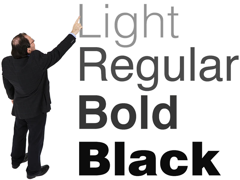 |
6. FontsUse a sans serif font like Poppins or Helvetica at size 16 point or higher for text, with bigger sizes for headings. If you want more choice, try Google Fonts — but please tone down the Comic Sans. |
 |
7. HyphensMake sure blocks of text are not hyphenated (when words are split at the end of a line). You can switch off hyphenation in your page layout software, or use EasyMaker which handles this automatically. |
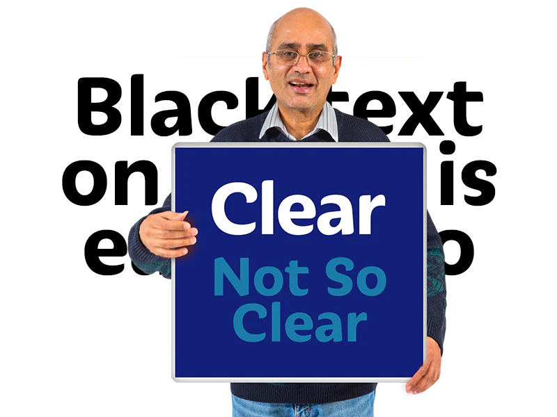 |
8. ContrastMake sure the text is clearly visible, especially if you are using colours. Black on white is generally best for body text, but life without colour can be boring. Sometimes squinting a bit can reveal poor contrast in a design. |
 |
9. PagesFor booklets, aim for 8–12 pages. We once witnessed a 100-page "Easy Read" document! The point is that large amounts of information are intimidating. A colourful front cover with a suitable picture makes your information distinct and recognisable. |
 |
10. Plan itDon't let Easy Read be an afterthought. Make sure there's plenty of time to create the information and distribute it while it's still relevant. Easy Read is as essential to people with learning disabilities as any other accessible format or translated language is to other groups. |
Ready to create Easy Read?
Get started with the Photosymbols Photo Library or let EasyMaker do the heavy lifting.
Want to learn more?
Our Foundation Course in Easy Read and Easy Read Design Course cover these principles in depth, with practical exercises and feedback from our team. Both courses lead to certificates. We also offer bespoke on-site or online training for you and your team.
Explore training options →